SEEN // December 2014
Have you ever started what seemed like a simple remodeling project and found obstacles that made it ridiculously complicated? Margaret Skinner (Margeaux Interiors ~ margeauxinteriors.com) brings an expert eye to these issues because she has a builder’s license in addition to her design credentials.
“The design process goes hand in hand with the building process,” Skinner says. “In addition to understanding the bones of the house, I speak the language of the building trades — that makes remodeling more efficient for the client.”
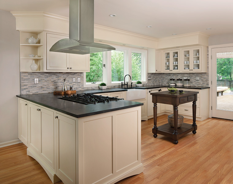
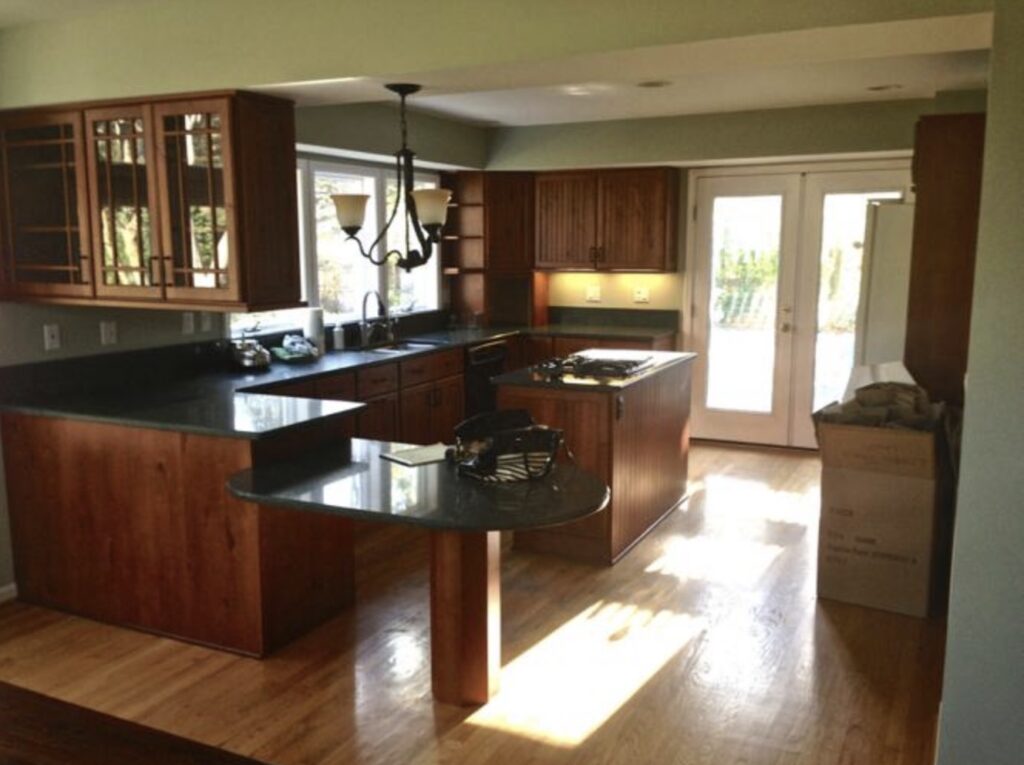
For example, when she remodeled the kitchen in this 1960s house (opposite page), obstacles began to surface. Previous homeowners had added on a kitchen that was dark, dated and entirely closed in by soffits. When the workers tried to remove the soffits, they discovered plumbing, electrical wiring and supports buried inside. Skinner worked with the trades to build the soffits into the cabinetry, creating the look of a fine furniture unit. With soffits removed over the peninsula, a stainless steel hood was hung from the ceiling like a piece of sculpture.
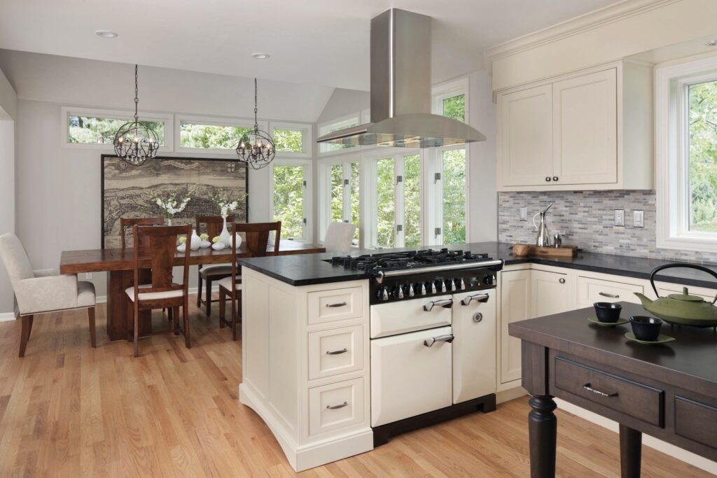
The new custom cabinetry was crafted with graceful arcs at the base to further enhance the furniture look. A vintage table, stained espresso to harmonize with the soapstone countertops, added interest while providing a decorative yet functional island. A glass tile backsplash and apron sink completed the look.
Another dramatic change was the addition of a dining area. The previous owners sat at the lowered peninsula counter to eat and used the adjoining space as a family room. Now the dedicated dining room has become a light-filled area, personalized by a historical map of London from the clients’ home in the U.K.
Modern Inspiration
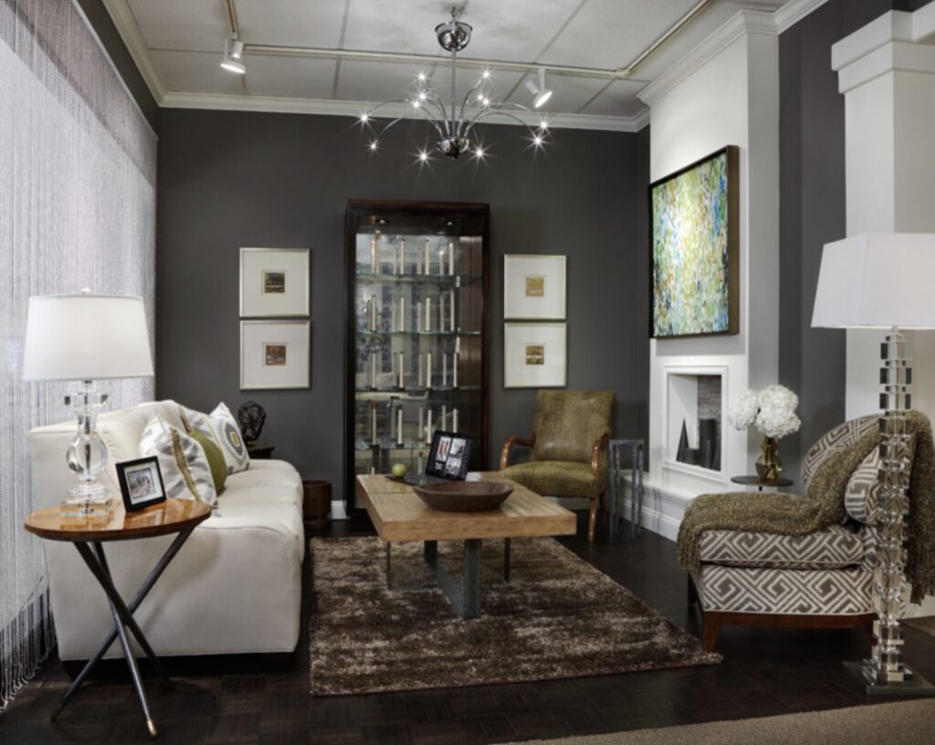
“Inspiration can come from anywhere,” Skinner says. She once designed a “techno room” that was inspired by the “box” from a computer tablet — the room’s color pallet became the crisp white background of the box and the gray color of the text with its silver highlights. In the room she added architectural dimension by building out a fireplace and painting the hearth and crown molding “tablet-box white” against gray walls.
A metal-beaded curtain on the opposite side dramatized the techno element, adding rich texture and a silver accent. The full wall of industrial-looking drapery invited light from the window to brighten the space. Anchoring the look, a gray accent wall featured a reflective etagere; inside, industrial sewing spools are repeated on every shelf, producing a simple yet mesmerizing affect. Small paintings with wide white mats and silver frames are hung symmetrically around the etagere, echoing the pallet and incorporating a touch of white.
Unexpected greens and browns added warmth to the setting. The colors were introduced in the painting above the fireplace and scattered into chairs, pillows, the carpet and throw. The chandelier and crystal lamps helped transform this unique room into a cozy setting.
The vignette was created for R.J. Thomas in the Michigan Design Center.
In discussing popular color pallets, Skinner says, “‘Greige’ is the new beige. After 10-plus years of beige, updating involves incorporating some gray tones. Punches of color that work with beige can also add a strong design element to tired rooms.”
Vintage Contemporary
The trend of injecting vintage and reused pieces into contemporary settings is often used in redesign plans.
“Sometimes the artwork precedes the design,” Skinner says.
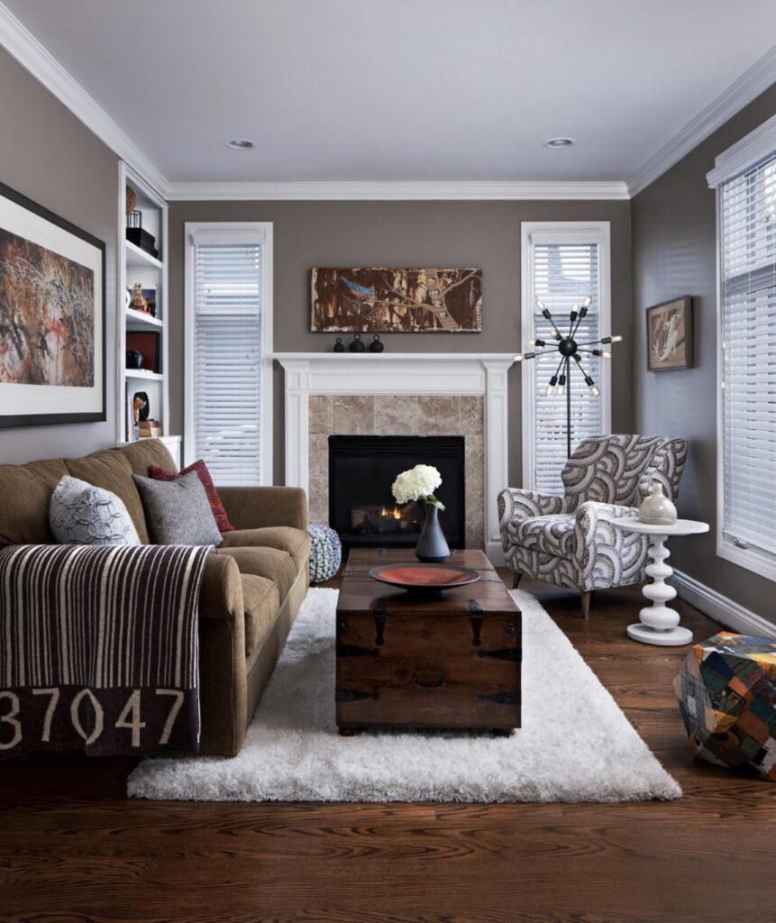
She told a story about clients who wanted to display an art collection they acquired while living in New York and Chicago. Skinner reused most of the existing furniture in what she called a “graffiti urban” setting.
She started by converting the beige walls to an updated greige as a backdrop to showcase the art. A throw designed to resemble a “bar code” and new pillows were added to an existing sofa.
But the dynamic of the room changed completely with the introduction of a chair covered in print that mimicked the movement of the artwork. The lines of an end table next to the chair complemented the fabric, and a funky lamp near the traditional fireplace completed the concept. These well-chosen elements transformed the room into the perfect space to enjoy the art collection.
By Susan Kehoe, Ph.D.

