Sherwin Williams // January 2014
Modern kitchens give off various vibes. Contemporary cool, farmhouse chic, ultra-progressive, midcentury modern vintage … the list goes on. What they all have in common, though, is a confident design that exudes a sense of ownership.
Definitive design requires relentless attention to detail — from appliances to light fixtures, from cabinetry to countertops. But the most important touch of all? The paint. Picking the right hues for the walls, trim and ceiling can make or break the overall effect of a kitchen.
When interior designer Margaret Presti, owner of Margeaux Interiors, first walked into the kitchen of homeowners David Collins and Christina Anderson, she was greeted with a sage green ceiling. "The color just wasn't working," Presti says. "It gave the space a somber, closed-in feeling."
Because David grew up in England, the couple wanted a space that had a bit of Britain to it, an inviting respite after a long day where they could enjoy a quick "cuppa" (tea).
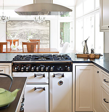
"The former kitchen was quite dark and old-fashioned," Presti says. "They wanted a traditional yet minimal look for their kitchen that would be functional but also beautiful." She worked with Prestige Design & Build of Birmingham to create a bright, contemporary "farmhouse" kitchen for the Ann Arbor couple.
Presti selected Sherwin-Williams Repose Gray (SW 7015), a light gray hue. The trim and ceiling are in Sherwin-Williams Alabaster White (SW 7008), which Presit says is "a slightly warmer white that tied the ivory cabinetry and appliances — mostly all-white for that modern appeal — together with the gray walls, countertop, backsplash, range hood and pewter hardware. We didn't want one color to overpower the other, but rather to complement it."
The cabinetry color was a major inspiration when it came to selecting the wall color, Presti recalls. "The homeowners wanted a warmer white versus a bright-bright white," she says. "And then we looked at the backsplash with its natural stone, which allowed us to further evolve our color selections. We didn't want the wall color to be too dingy, too bright or too washed out, plus we wanted it to tie in with the rest of the house, which included a lot of ‘builder beiges.'"
Presti also took into account the island's wood countertop and the large farmhouse-style wood table. "I knew the warm wood tones would mix well with ivory and gray hues," Presti says. The addition of two eclectic, caged light fixtures above the kitchen table "nicely combines the couple's regard for tradition with a modern sensibility," she says.

